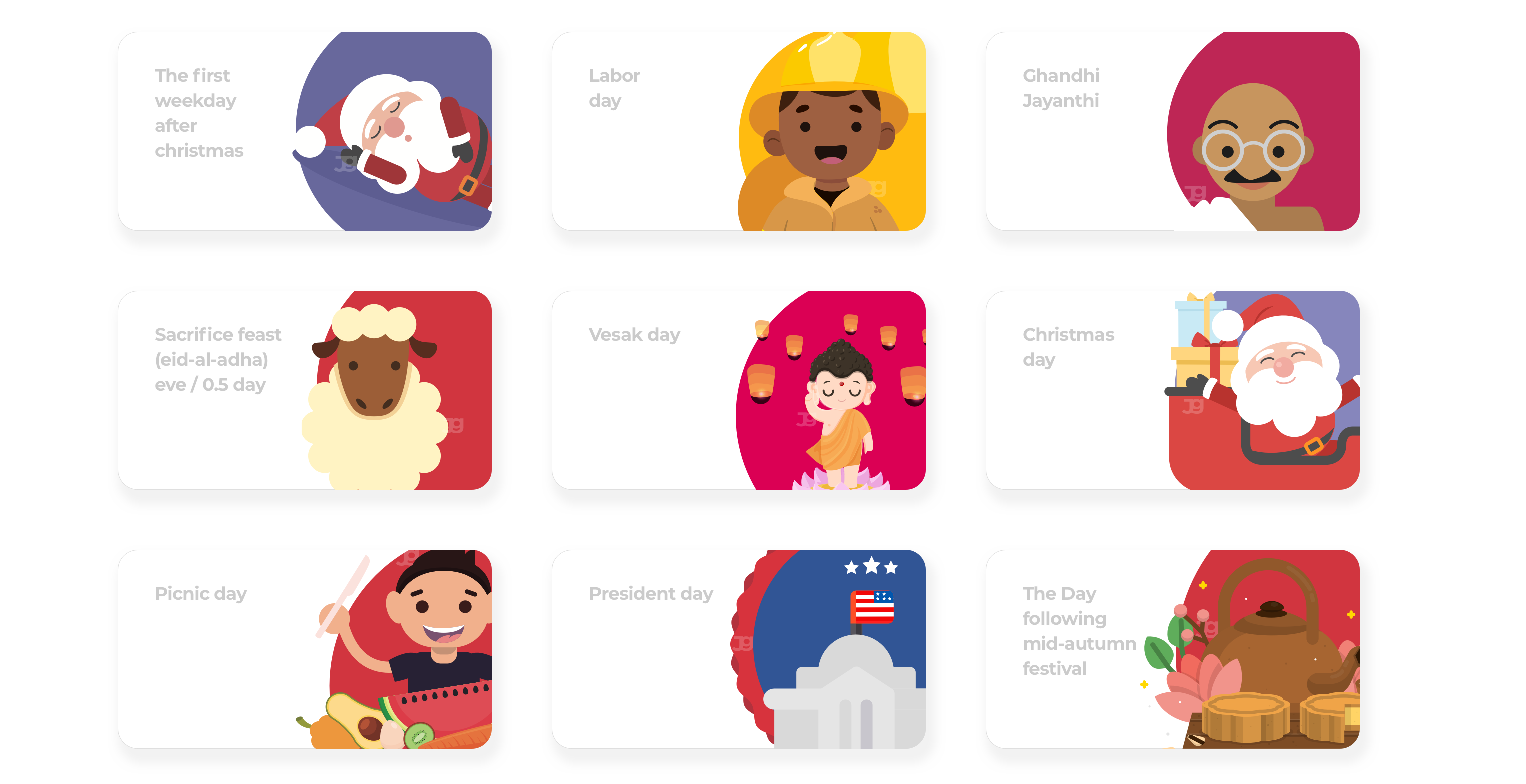
Holiday illustrations

illustration system, Graphic designs, Brand specialist
THE CONTEXT A developing business venture, ServiceNow needed a brand identity to reflect its core values of employees experience and refelecting those in illustrations. Brainstorming and exploration led to a brand personality that blends a bold, communal vibe with an active lifestyle.
THE CHALLENGE This was completely on designer's choice, in terms of providing the right style, mood and colors. Few hours research in brand gave me an idea to proceed this to have an initial structure. Took an additional hours to search about the holiday details globally. The culture and the mental model was an important key when the story board screens are developed to align the brand guideline.
SETTING UP COLOR PALETTE & PATTERN Created a palette directly from the research findings, used illustrator to swatch the default tone of it. Now the palette with 4 major colors are ready, those need to be tweaked to align with the brand colors and majorly have to be identified the family colors from these core colors.
SATURATION LEVEL AND HUE FROM SN COLOR PALETTE
PRIMARY COLOR AND BRAND INSIPIRATION
SHAPES & PATTERN
WORKING WITH SKETCH AND ILLUSTRATOR FOR COLOR ADJUSTMENT It was very much straight forward to identify the right tone, because I used the brand palette which explains the exact hue, contrast, and saturation levels. So, it was easier for me to use sketch tool, which was more appropriate for this project. To me, identifying the right tone is very important. This creates a positive impression and gives a feel good emotional effect. It’s all about experimentation and little knowledge in color sense.
BRINGING THE EXPERIENCE TO LIFE This process surprised me with handful of results using only the curves, levels, and selective color adjustment layers applied to the original default color palette.
64
Hours
240
Holidays
345
Illustrations
1
Designer
UP