Design system

Design language, Red line, brand identity
THE CONTEXT Create a visual language that synthesizes the classic principles of design with the innovation of technology and science.
THE CHALLENGE Aside from a font file, there were none. Each and every design project started from scratch; new files, new artboards, new shapes, new symbols. My process involved taking a screenshot of the page I was working on and then designing on top of it. Parallely I was working on both creating UX and UI.
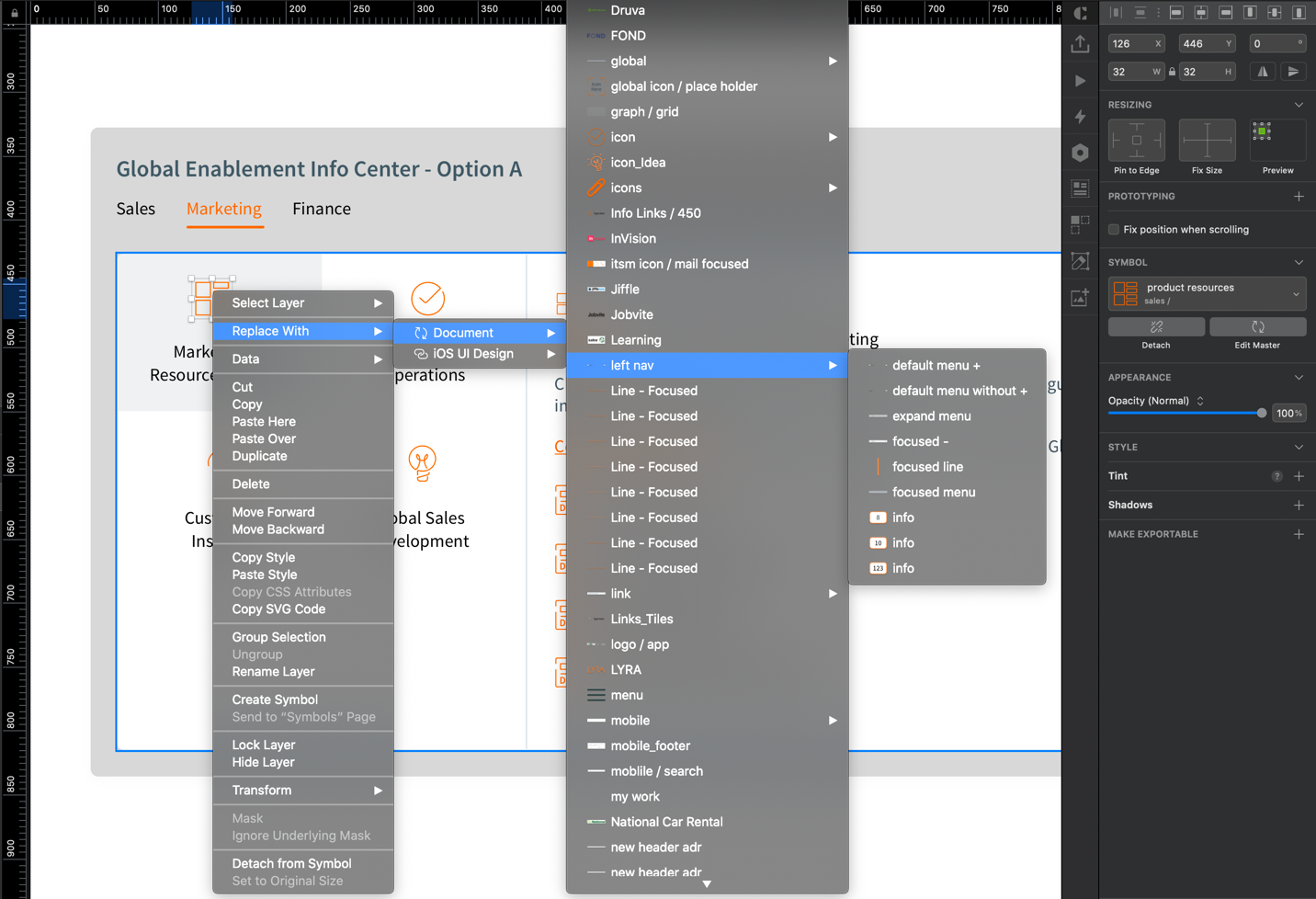
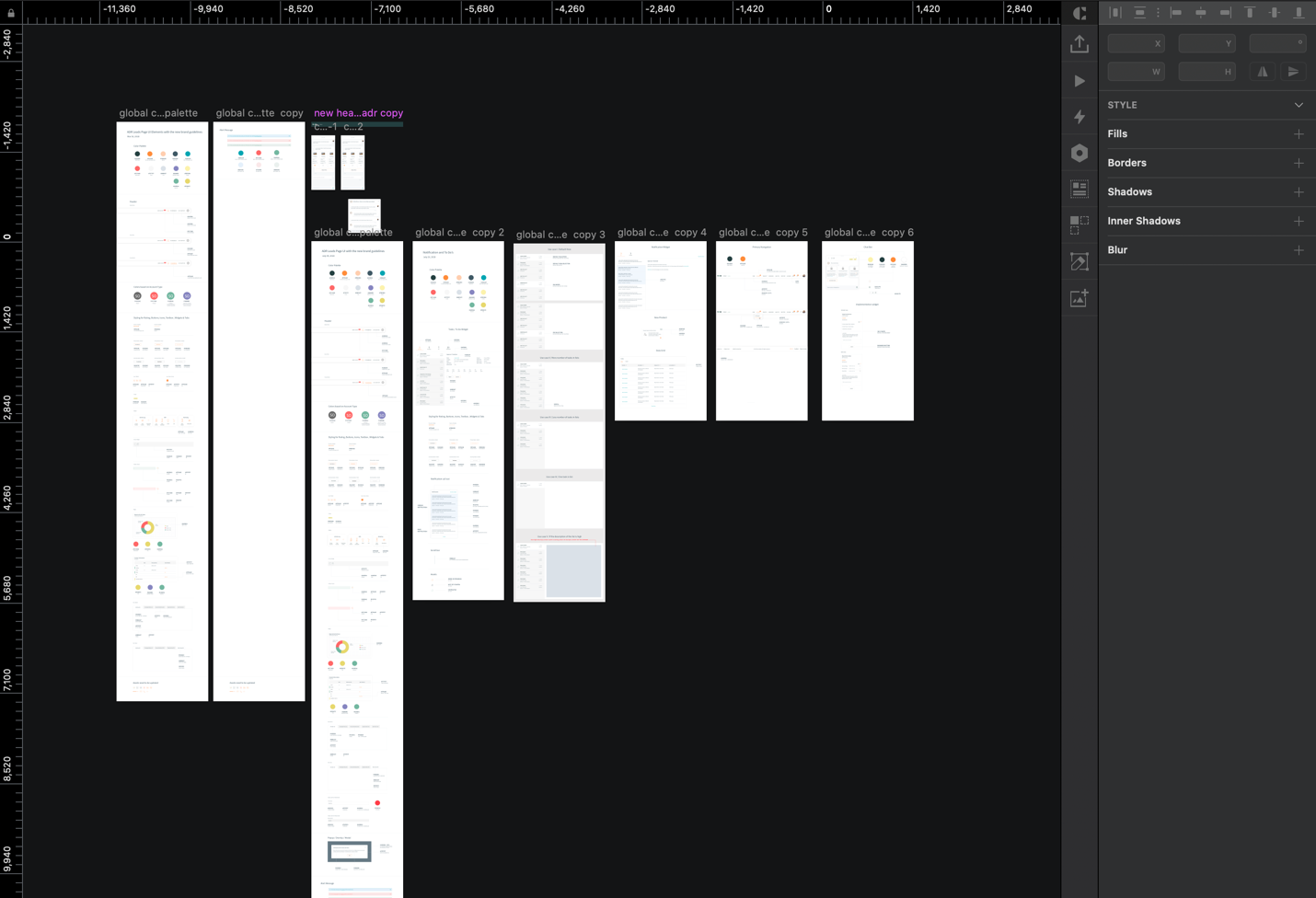
INVENTORY With an uncertain strategy in mind, my next task was to inventory every UI element in the application. I took screenshots of every page, every modal, every menu, and well…everything in the web app. Then I painstakingly recreated them in Sketch.
AUDIT Captured the assets & design pattern I grouped them into categories. Viewing them side-by-side revealed exactly why needed a system. There were dozens of buttons styles, incorrectly applied font weights, and single-use icons everywhere.
EDIT I had to make decisions regarding naming conventions, categorization, organization, and presentation. I spent a lot of time naming and renaming my Sketch layers and organizing symbols page. This was the most time consuming portion of the work.
EVOLVE As I said, I set myself weekly reminders to update, review, and share the design system with developers and technical engineers to identify feasablity concerns. Brand team folks were participated to make sure everything goes with brand promises.
ARTICULATING COMPONENTS End of the research I found 2 of the best resources, Atomic Design, by Brad Frost, and a site called Pattern Lab and the companies like Google, Apple have complex and well-documented design systems.
End of the research I found 2 of the best resources, Atomic Design, by Brad Frost, and a site called Pattern Lab and the companies like Google, Apple have complex and well-documented design systems. This would help to categories the elements, components, widgets, templates and the pages.
UP