

ServiceNow needed a brand identity to reflect its core values of employees experience and refelecting those in illustrations.
Brainstorming and exploration led to a brand personality that blends a bold, communal vibe with an active lifestyle.
Based on the research findings created an emotional connetions between the system and employees of the organization.
Most connected visuals encouraged ServiceNow employees to feel the freshness and the promises of ServiceNow brand.


One of the biggest components I wanted to keep in the identity was its flexibility.
I believe that it is so important that it could adopt various textures, materials, colors, and images to describe.
One of these extracted colors is the primary color. There are three primary goals for the primary color:
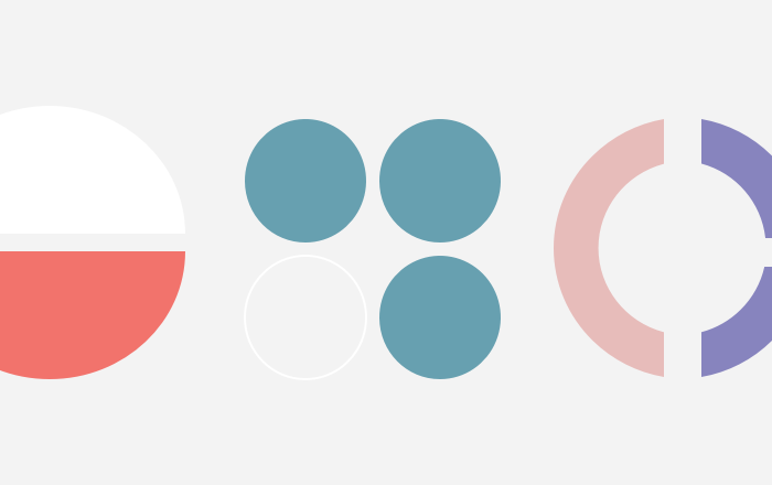
These illustrations are created to communicate the brand message and transmit the organization communications to their employees. These illustrations stays ServiceNow internal portal & apps.
Mostly these illustrations were created to express specific content about the organizations event. These would stay in their facebook websites and in all of the place where people would notice.
Holiday illustrations are communicating the global holiday details and those stays in the employee experience portal and the internal & official applications of the ServiceNow web pages.
||